
One of the biggest weather stories in Nebraska and much of the country is the worsening drought over much of the western United States. Drought can be devastating to an entire region, making it one of the biggest weather disasters that can be experienced in the United States. Drought during the 1930s was so significant it defined the entire era of the Great Plains, the "Dust Bowl". Drought in California during the 2010s brought water shortages to the region. Now, Nebraska is experiencing the worst drought since 2012 with no signs of it improving.
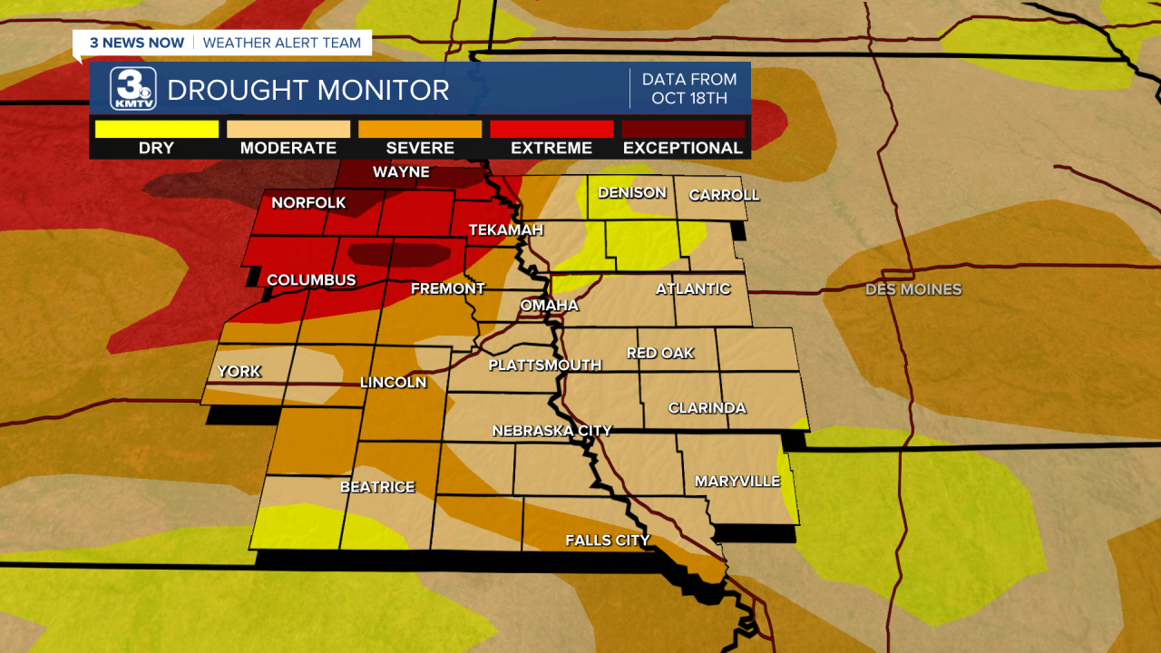
To explain how bad a drought gets, these maps are often used as seen above. These maps are the US Drought Monitor, which come out every Thursday. You might have seen these maps so often, but have you ever stopped to think about how it collects its data? How did the drought monitor come about? As well, the drought monitor has a special connection to Nebraska, find out how below!
THE HISTORY OF THE DROUGHT MONITOR
Although drought has been a serious problem since humans discovered agriculture, measuring and monitoring drought conditions has only been a recent development. After a series of droughts in the mid to late 1990s, the discussion of classifying and monitoring drought became a public interest issue. Talks between the National Oceanic and Atmospheric Administration (NOAA), the US Department of Agriculture (USDA), and the National Drought Mitigation Center (NDMC) to begin a monitoring service.
The conclusion was to create a categorical system for measuring drought, not too dissimilar as the Fujita scale for tornadoes or the Saffir-Simpson scale for hurricanes. To display the data, a map would be created weekly which would visually represent the drought across the United States per week. Thus, by 1999 the US Drought Monitor was born.
An interesting Nebraska connection to the formation of the drought monitor is also there. The NDMC was founded in 1995 at the University of Nebraska-Lincoln, specifically to monitor drought conditions across the world and to highlight their impacts. It would be the NDMC's website that would host the Drought Monitor. Thus, the center of the Drought Monitor resides right here in eastern Nebraska!
Immediately the Drought Monitor became an instant success as the public and media picked it up and distributed it. Today, it is the standard way to look at drought conditions.
CATEGORIES OF DROUGHT
Categories for the Drought Monitor are divided into 5 sections labelled D0-D4.
- D0 stands for "abnormally dry", meaning the region is experiencing dry weather but a formal drought has not developed yet.
- D1 stands for "moderate drought" which means the region is experiencing some damage to crops and water levels are getting low.
- D2 stands for "severe drought" where crop damage is likely and water restrictions might go into place.
- Things only get worse into D3 "extreme drought" where crop losses become major and water levels go extremely low.
- Finally, there is D4 "exceptional drought" which is the highest category. This final category means widespread crop damage, and historically low water levels leading to significant restrictions.
HOW ARE THESE CATEGORIES MEASURED?
The actual categories are split into percentages of the likelihood of the category occurring in a given year. D0, the lowest category, has a 20-30% chance of developing in a given area in a given year. These numbers grow smaller up to D4, the highest category, has a less than 2% chance of developing in a given area in a given year.
The drought monitor takes into account two main factors that show a drought: soil moisture and water levels. How these are calculated are a number of models which take in real-time data such as temperature and precipitation and compares it with historical data.
There are four primary modeling units used:
- Palmer Drought Severity Index (PDSI), used since the 1960s to analyze soil moisture and water levels. The PDSI had been the standard in monitoring drought until the Drought Monitor came along, but still is used today.
- The Climate Prediction Center (CPC) Soil Moisture Model, which uses real-time precipitation data to present soil moisture.
- The US Geological Survey (USGS) streamflow, which takes data from over 3,000 stream gauges to compare current streamflow to historical streamflow.
- Standardized Precipitation Index (SPI) which looks at precipitation data and compares it to the historical data to see how above/below average for a given amount of time.
Other models are used to assess vegetation health, snowpack in the mountains, and other data to analyze in creating the maps. Finally, the Drought Monitor takes in data from over 450 local observers across the country to describe drought conditions and its impacts at the physical level. These observers range from state climatologists, National Weather Service officials, and hydrologists among others.
HOW IS THE MAP MADE?
Although it uses computer data, the map is hand-made! Authors for the map are nationwide and include a variety of organizations, many mentioned above but a few more include:
- National Drought Mitigation Center (NDMC) based out of Lincoln, Nebraska
- National Oceanic and Atmospheric Administration (NOAA) based out of Washington D.C.
- United States Department of Agriculture (USDA) based in Washington D.C. as well
- Climate Prediction Center (CPC) based in College Park, Maryland
- National Centers for Environmental Information (NCEI) located in Asheville, North Carolina
- Western Regional Climate Center (WRCC) which is located in Reno, Nevada
The various authors from these institutions will draw the map, taking turns where the author switches every two weeks. The author begins on Monday with analyzing the various models mentioned above and makes a list of proposed category changes (if any) by Monday. It then goes to the other authors for feedback, which ends by Tuesday. The map is then made and released to the public on Thursday morning every week.
It is important to note that these maps are to show current drought data and are NOT a forecasted drought map.
